Selecting an LCD module size that matches your enclosure isn’t just about maximizing screen real estate. A display that looks perfect in specifications can fail in practice if clearance, usability, or assembly constraints weren’t properly considered.
The right LCD module size balances four critical factors: it must fit your actual window opening and depth budget, support comfortable readability at your viewing distance, provide adequate clearance for connectors and assembly, and align with your UI design requirements.
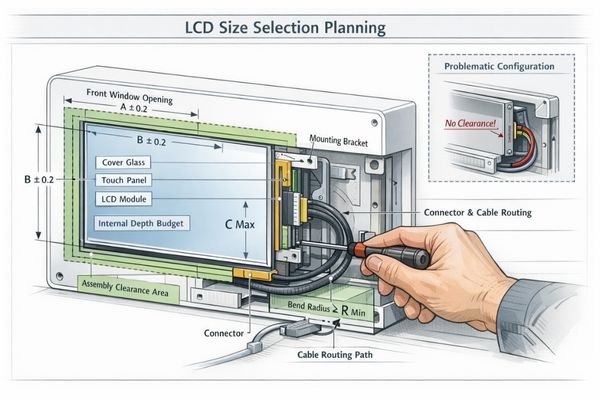
In many device integration projects, size selection failures happen when teams focus on diagonal measurement while overlooking enclosure realities. The display may technically fit the visible window, but connector placement, cable routing, mounting stack-up, or service access becomes impossible—forcing expensive enclosure redesigns1. The safest approach is to lock the window cutout and clearance constraints first, then validate usability and assembly with realistic mockups before tooling.
What enclosure dimensions should I lock first before choosing an LCD module size?
Before comparing LCD specifications, you must define the physical boundaries that cannot change.
Start by locking three non-negotiable enclosure constraints: the front window cutout that defines user visibility, the internal depth budget including all stack-up layers, and the assembly method that determines mounting and service requirements.
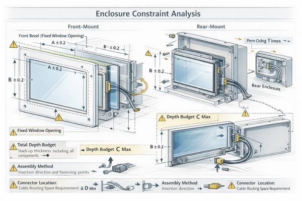
Define these boundaries clearly to avoid late-stage compatibility issues. A practical definition of “depth budget” should include the LCD thickness, connector height, cable exit direction and bend radius, strain relief space, mounting brackets/bosses, sealing/gasket compression zones, and any touch/cover glass stack-up. If the window cutout is fixed, the display choice must be driven by active area alignment and clearance—otherwise you risk a “fits the window but can’t be assembled” outcome.
Window and Bezel Definition
Measure what users actually see, not marketing diagonal. Define the window cutout2, the intended bezel overlap, and the tolerance range you can accept for cosmetic gaps and alignment. If active area alignment is tight, plan extra margin so assembly variation does not shift the image off-center or cause UI elements to be partially masked by the bezel.
Depth and Access Planning
Account for LCD thickness, connector height, cable bend radius, and any service requirements. Front-insertion and rear-mounting have very different clearance needs, and service access can be the deciding constraint in compact enclosures. If your design requires field replacement, confirm that connectors and fasteners remain reachable without damaging the window, seals, or cosmetics.
How do I translate my viewing window into the right active area and aspect ratio?
Your window opening must map cleanly to available LCD active areas.
Successful window-to-display mapping requires matching three factors: the aspect ratio must suit your UI layout patterns, the active area must efficiently fill your window without awkward borders, and assembly tolerances must allow proper alignment during manufacturing.
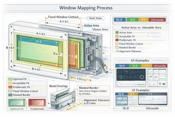
Don’t assume any UI can scale to any shape. Wide displays suit dashboard layouts and status strips, while square formats work well for grid-based interfaces and balanced navigation. A common failure mode is choosing a panel whose active area looks close to the window but forces excessive bezel masking or leaves inconsistent borders once tolerances and alignment shifts are included. If the window cutout is fixed, choose an active area and aspect ratio that fill it cleanly with realistic alignment tolerance—then design the UI safe zone3 so critical elements never land near masked edges.
What size is actually usable for touch targets and readability at my typical viewing distance?
The right size prioritizes usability over maximum diagonal measurement.
Optimal sizing depends on three usage factors: text must remain readable at your typical viewing distance and angle, touch targets must provide comfortable interaction without cramping, and the overall layout must support your users’ task flow efficiently.

Close-range devices can work well with moderate sizes if the UI hierarchy is clean. For arm’s-length viewing or high ambient light conditions, larger displays or simplified layouts may be necessary. If users interact in a hurry or with less precision (gloves, vibration, quick taps), prioritize larger touch targets4 and spacing over squeezing more content on screen. If users often view the display from farther away or at an angle, prioritize a larger visible area or larger typography and clearer contrast rather than assuming higher resolution alone will solve readability.
Consider how users actually interact with your device—rushed touch interactions favor larger targets, while glanceable information can work with smaller text if contrast and viewing angle are optimized.
How much clearance do I need for the LCD module, connector, cable routing, and mounting stack-up?
Many "size failures" are actually clearance planning failures.
Proper clearance planning requires accounting for four stack-up elements: the module outline plus connector body dimensions, cable exit direction and bend radius requirements, any touch sensor and cover glass additions, and mounting hardware with assembly tolerances.
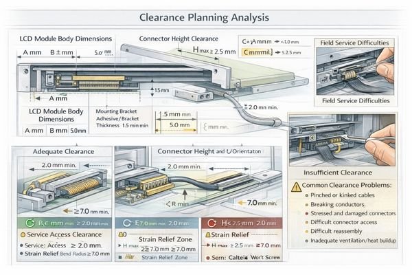
Budget space conservatively—adhesives, gaskets, and brackets add thickness that can shift window alignment. If you need to add touch capability later, ensure your depth budget5 can accommodate the complete stack. In practice, adding touch and cover glass later doesn’t just add thickness—it can shift where the “visible window” sits relative to the active area, change reflections and perceived clarity, and introduce parallax at the edges. If touch is even a possibility, treat the full stack-up as part of the initial size decision rather than a future add-on.
How do I choose between standard shapes and special form factors like ultra-wide, square, or round displays?
Form factor choice should match both UI requirements and enclosure capabilities.
Special form factors work best when three conditions align: your UI architecture naturally fits the shape, your enclosure window can support the proportions, and your mechanical tolerances can handle the alignment requirements.
Ultra-wide displays like BU215X excel when height is constrained but persistent status information is needed. Square formats such as SQ220S suit card-based interfaces and balanced layouts. Round displays like RD157H create distinctive design appeal but require careful UI adaptation. If your window cutout and bezel are already constrained, special shapes demand even tighter alignment planning so the visible border remains uniform and UI elements remain within safe zones.
Avoid forcing UI patterns into incompatible shapes—the form factor should enhance usability, not compromise it. Treat form factor selection as the first decision and the specific model as the second; the enclosure window, UI safe zones, and assembly tolerances must all support the chosen shape.
What prototype checks should I run to confirm the size choice before committing to tooling?
Physical validation prevents expensive surprises after tooling commitment.
Effective size validation requires testing four aspects: visual and touch usability with realistic mockups, mechanical fit with actual connectors and cables, assembly process verification with tolerance stack-ups, and service access confirmation with real enclosure geometry.
Create a 1:1 mockup using printed bezels and actual display modules. Test at intended viewing distances and angles—what looks good on your desk may be problematic at the real installation height. Verify connector and cable routing with realistic bend radii, and confirm that assembly steps are repeatable with tolerances, not just “possible once” by hand.
Verify connector and cable routing with realistic bend radii. Can you assemble and service the display without damaging seals or requiring enclosure modifications? Before tooling, treat four checks as mandatory: (1) readability and touch comfort in real viewing conditions, (2) connector and harness routing with correct bend radius and strain relief, (3) assembly tolerance stack-up (window alignment and bezel overlap consistency), and (4) serviceability (removal/replacement without damaging seals/cosmetics).
Check cosmetic details: bezel overlap uniformity, border symmetry, and UI element positioning relative to window edges. Even simple mockup tests catch most sizing problems early.
Conclusion
Choosing the right LCD module size requires balancing window constraints, usability requirements, and mechanical realities. By locking enclosure boundaries first and validating with realistic prototypes, you can avoid costly redesigns and ensure your display choice enhances rather than compromises your product.
MDYN specializes in helping customers match LCD modules to real enclosure requirements. Our engineering team can help validate your size selection against mechanical, optical, and usability constraints. For detailed discussion of your enclosure requirements, please contact our engineering team.
✉️ 961531917@qq.com
🌐 https://lcdmodulepro.com
-
Exploring strategies to avoid enclosure redesigns can save time and resources in your device integration projects. ↩
-
Defining a window cutout accurately is essential for aesthetic and functional alignment in display products. ↩
-
Learn about the significance of a UI safe zone to ensure critical elements are well-placed and enhance user experience. ↩
-
Exploring this resource will help you understand how larger touch targets enhance user experience, especially in hurried interactions. ↩
-
Understanding depth budget is crucial for ensuring your design accommodates all components without compromising functionality. ↩

