When engineers evaluate an LCD display module, resolution and brightness usually get most of the attention. Those specifications matter, but they do not tell the whole story. If the product depends on visual quality, branded colors, gradients, or a polished user interface, color gamut becomes an important part of the discussion.
Color gamut defines the range of colors an LCD module can reproduce, usually expressed against a reference color space such as sRGB or NTSC. A wider gamut can enable more saturated color reproduction, but it is not automatically better. What matters is whether the gamut matches the application, the content source, and the rest of the display system.
In actual LCD module selection projects, one of the most common mistakes is to treat color gamut as a simple ranking number. Teams see a larger percentage and assume the display will look better in every case. In practice, that often leads to the opposite result. If the UI, software pipeline, or source content is based on a narrower standard color space, a wider native gamut can make the image look too strong, too saturated, or simply wrong.
That is why color gamut1 should never be judged on its own. It needs to be reviewed together with color accuracy, white point stability, gamma behavior, and the way the system handles color from source to screen. The real question is not just how broad the gamut is. The real question is whether the display can deliver the right color behavior for the application, and whether that behavior remains stable and repeatable in production.
What Does Color Gamut Mean in an LCD Display Module?
At the most basic level, color gamut describes the range of colors an LCD module is capable of showing. It defines the boundary of what the display can reproduce.
In an LCD module, color gamut represents the total range of colors the screen can display. This range is defined by the coordinates of its primary red, green, and blue colors and is compared to a reference color space to determine how much of that standard the module can cover.
From an engineering perspective, color gamut is easier to understand when it is separated into two questions. First, which reference standard is being used? Second, how well does the display reproduce colors within that range?
The Role of Color Space Standards
A gamut value only makes sense when it is tied to a defined reference. That is why datasheets usually describe color gamut using standards such as sRGB, Adobe RGB, or NTSC. These standards define different target color ranges within visible color space.
When a supplier states that a display reaches a certain percentage of sRGB, it means the LCD module can reproduce that proportion of the sRGB-defined color range. For many embedded and commercial systems, sRGB2 is the most relevant benchmark because it aligns with common digital content, standard UI design workflows, and most operating environments. This is also why the same percentage number can mean very different things depending on which reference standard is being used.
Gamut vs. Color Accuracy
A wider gamut does not automatically mean the display is more accurate. These are two different engineering questions. Gamut describes display capability. Accuracy describes whether the reproduced color is actually correct.
A display can have a very broad native gamut and still render a target color poorly if calibration is weak or the system is not managing color properly. On the other hand, a module with a more standard gamut can produce highly reliable results if it is well matched to the target color space and properly controlled. In practice, display range and display accuracy should always be evaluated together.
How Is Color Gamut Measured and Described?
Color gamut is not a subjective impression. It is a measurable characteristic based on the actual light output of the LCD module.
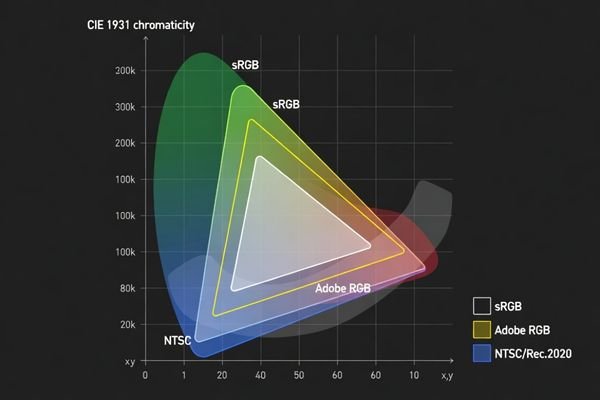
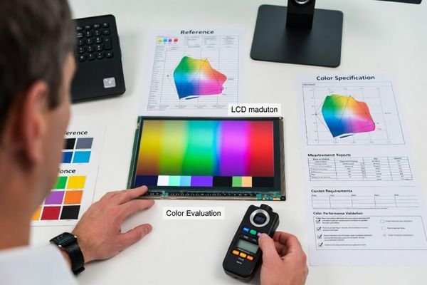
Color gamut is measured by using a colorimeter or spectroradiometer to read the display’s primary red, green, and blue colors. These coordinates are then plotted on a CIE chromaticity diagram and compared to a reference standard such as sRGB or NTSC to calculate coverage.

In real OEM validation work, this is the point where a lot of confusion starts. A reported value like 100% can look impressive, but without context it says very little. The first thing I usually check is the reference standard. A number based on NTSC is not directly comparable to a number based on sRGB. In many display discussions, 72% NTSC is often used as an approximate reference close to full sRGB coverage, but direct comparison still depends on the exact measurement basis and reporting method.
The next thing to check is how the result was measured. Was the display fully warmed up? At what brightness level? What measurement device was used? Was the result reported as 2D area coverage on the chromaticity diagram, or through another method? Two suppliers can both publish strong-looking gamut figures while describing different things.
This is why supplier data should always be reviewed carefully. A gamut percentage3 is only useful when the reference color space, test condition, and measurement approach are stated clearly. Without that information, the number is not much more than a marketing shorthand.
What Does Color Gamut Affect in Real LCD Module Applications?
In a finished product, color gamut affects more than just how vivid the image appears. It influences how the interface feels, how branded visuals are perceived, and how reliably color-based content is communicated.
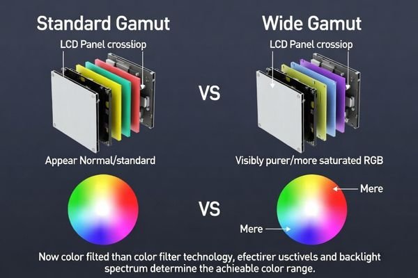
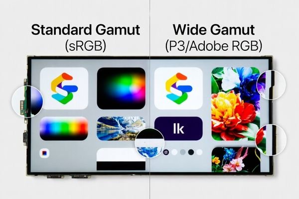
Color gamut affects color richness, saturation, and the overall visual character of displayed content. A wider gamut can improve the presentation of logos, graphics, gradients, and photo-like content, but without proper color handling it can also create oversaturation and visual inconsistency.
In actual products, the effect depends heavily on the use case. A well-matched gamut can improve the visual result. A poorly matched one can make the display look unnatural or inconsistent.
| Application Area | Impact of Standard Gamut (e.g., sRGB)4 | Potential Impact of Wide Gamut |
|---|---|---|
| Industrial HMI / Control Panel | Provides predictable and stable status colors that match established UI expectations. | Can make interface colors look too strong or less natural if the system is not color-aware. |
| Instrumentation Displays | Supports controlled and repeatable presentation of charts, indicators, and interface graphics. | May improve visual richness in graphic-heavy layouts, but can also introduce mismatch if calibration is weak. |
| Branded Retail / Kiosk | Delivers safe and familiar color behavior for standard digital assets. | Can reproduce more vivid brand colors and richer product visuals when the content is designed for it. |
| General Embedded UI | Offers a practical baseline for icons, text, and standard interface elements. | Can improve gradients and graphical elements, but only if the software and assets are matched properly. |
This is where system-level thinking matters. The goal is not to choose the largest possible gamut. The goal is to choose a gamut that fits the content and produces predictable results. If that alignment is missing, color errors are very likely.
Because gamut affects the final image differently depending on the application, a larger gamut is not automatically the better choice.
Is a Bigger Color Gamut Always Better?
From an engineering standpoint, the answer is no. A bigger color gamut is only better when the application can actually benefit from it and the rest of the display pipeline can use it correctly.
A bigger color gamut is not always better. While it can offer more saturated color capability, it may also cause oversaturation and color mismatch if the source content and system are based on a smaller color space. In many professional applications, stable and predictable color behavior matters more than the widest possible gamut.
One common failure point in display evaluation is assuming that wide gamut automatically improves every interface. Most standard digital content is still created around sRGB or similarly managed workflows. If that content is shown on a wider-gamut display without proper color management, the result can be exaggerated reds, unnatural skin tones, overdriven UI colors, and branded visuals that no longer match their intended design.
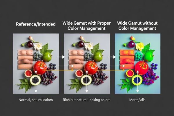
The Problem of Oversaturation
Oversaturation is one of the clearest examples of why a wider gamut can become a problem. The display has the capability to produce stronger colors, but the system may not know how to map the original content correctly. When that happens, familiar colors look off. The screen may appear vivid at first glance, but not accurate or trustworthy.
In commercial and embedded products, that is often a bad trade. A display that looks visually aggressive but inconsistent can make the product feel less refined, not more advanced.
Prioritizing Stability and Consistency
In many industrial and embedded applications, stable color behavior is more valuable than maximum saturation. Operators often need predictable status colors, repeatable interface appearance, and consistency across devices in the field. In those situations, a well-controlled standard gamut can be a better engineering choice than a wider gamut5 with looser control.
This is also where production matters. Even if a wide-gamut sample looks attractive during early evaluation, it still has to remain repeatable across production batches. For many B2B projects, that repeatability is more important than pushing the widest theoretical color range.
How Should Engineers Evaluate Color Gamut During LCD Module Selection?
A useful gamut evaluation process starts with the application, not with the largest percentage value on a datasheet.
Engineers should evaluate color gamut by first defining the target color space, content type, and system color-handling capability. Gamut should then be reviewed together with color accuracy, white point, gamma behavior, and supplier measurement transparency to confirm that the LCD module will perform correctly in the real product.
In practical LCD module selection work, I usually recommend a structured process.
Start by defining the content and target color space. Is the UI designed around sRGB? Does the product use photo-like content, branded graphics, or simple interface colors? Is the software stack capable of managing color correctly, or is the display expected to behave predictably without advanced color handling?
Next, compare the gamut specification in context. A large coverage value is not enough by itself. It should be checked together with color accuracy, white point behavior, grayscale performance, and overall display stability. A wide-gamut module with weak calibration can still produce poor visual results in the field.
Then review the supplier’s measurement method carefully. Supplier gamut data is only useful when the reference standard, measurement condition, and reporting approach are clearly stated. Percentage values without this context are easy to misread. If the project depends on consistent color behavior, it is also important to ask about batch consistency, repeatability, and long-term calibration stability.
Finally, validate real samples using the actual UI and system environment. This is the most practical step. Even when the datasheet looks promising, sample evaluation often reveals whether the display behaves naturally with the real content. For most OEM projects, this is where the right decision becomes much clearer.
FAQ
What is color gamut in simple terms?
Color gamut is the range of colors an LCD display module can reproduce. It describes how much of a target color space the display can cover.
Does a wider color gamut always mean better image quality?
No. A wider color gamut can allow richer colors, but image quality also depends on color accuracy, calibration, white point, brightness, and how the system handles color.
Why do some LCD modules use sRGB while others mention NTSC?
These are different reference standards. A gamut percentage only has meaning when the reference standard is clearly stated, so values from different standards should not be compared directly without context.
Can an LCD module with a larger gamut still look inaccurate?
Yes. A larger gamut does not guarantee accurate color reproduction. Poor calibration or lack of color management can still make the image look oversaturated or inconsistent.
What matters more in industrial equipment, wide gamut or stable color?
In many industrial applications, stable and predictable color performance matters more than the widest possible gamut. The right choice depends on the actual visual requirement of the product.
How should engineers compare color gamut data from suppliers?
Engineers should confirm the reference color space, measurement method, test condition, and repeatability of the reported data. Gamut percentages without that context can be misleading.
Conclusion
Color gamut is an important part of LCD display module performance because it defines how broad a range of colors the display can reproduce. But it should never be treated as a standalone quality score. A wider gamut can be valuable in the right product, with the right content and the right system pipeline. Without that alignment, it can just as easily create oversaturation, mismatch, and unnecessary complexity.
So no, a bigger color gamut is not always better. In practice, it is only better when the application, software, and display behavior are matched properly. For many embedded and industrial systems, accurate, stable, and repeatable color performance is more important than simply chasing the largest gamut figure on paper.
At MEIDAYINGNUO, I recommend evaluating color gamut as part of a complete color-performance workflow. That means reviewing gamut together with color accuracy, white point, calibration quality, batch consistency, and real application behavior. When that process is done properly, the selected LCD module is far more likely to deliver color that is not just broader, but genuinely useful, reliable, and production-ready.
✉️ info@lcdmodulepro.com
🌐 https://lcdmodulepro.com/
-
Understanding color gamut is crucial for selecting displays that accurately represent colors, ensuring the best visual experience. ↩
-
Understanding sRGB is crucial for anyone working with digital content, as it ensures color consistency across various devices. ↩
-
Exploring gamut percentage helps clarify its significance in display quality and ensures informed purchasing decisions. ↩
-
Understanding the impact of standard gamut helps ensure predictable color representation in various applications. ↩
-
Understanding the pros and cons of wider gamut displays can help you make informed decisions about color management and display quality. ↩